Letters That Hold Their Course: The Enduring Craft of Classic Boat Signwriting
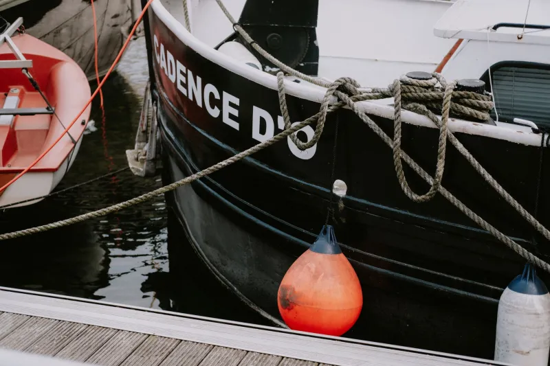
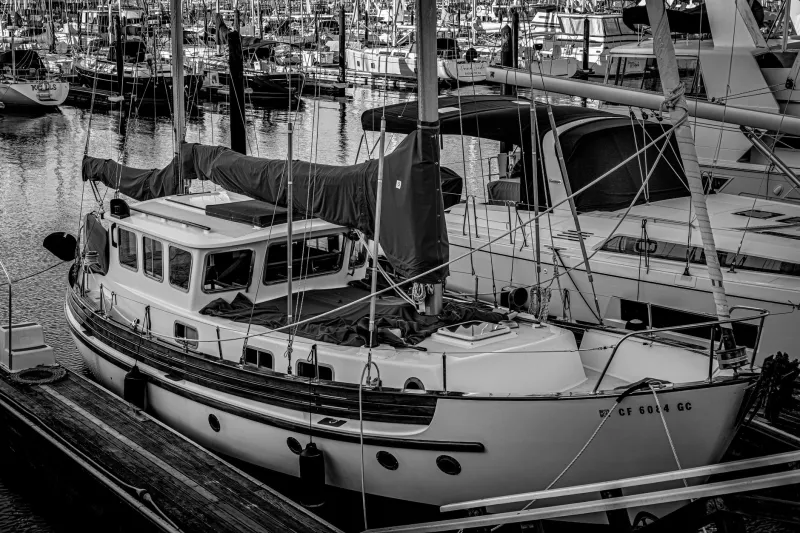
Walk along any old harbour wall and you will see the names before you see the boats. Misty Maid, Rose of Devon, Grey Seal. Some are crisp and bright, others softened by salt and sun until they look like they were always part of the planking. On a classic boat, that lettering is not decoration bolted on at the end. It is one of the last things applied and one of the first things noticed. It tells you where a boat belongs, who cared for it, and sometimes how long it has been doing the rounds.
Signwriting is a quiet art. It does not announce itself like a new engine or a freshly varnished cabin. It sits on the transom, on the bow, along the topsides, and waits for the right light. In 2026, with so much boat work driven by spreadsheets and quick turnarounds, the signwriter’s brush still moves at its own pace. That is part of the appeal.
Where the brush meets the transom
Most classic boat signwriters do not work in grand studios. They work in small sheds near boatyards, in converted garages, or on trestles beside a hull that is up on the hard. You will find them around Falmouth and Dartmouth, in the yards behind Cowes, along the East Coast at Oulton Broad and Lowestoft, and in the old marine quarters of Faversham and Bristol. Some travel with a van full of brushes, gold size, varnish and chalk. Others have a bench that has not moved in thirty years.
A good signwriter reads the boat before mixing any paint. They look at the sheerline, the age of the paint system, the quality of the light on the transom, and the way the owner talks about the vessel. A working smack may want bold, no-nonsense lettering that can be read from the quay. A 1930s cruising yacht may suit a finer serif with a little flourish. A restored motor launch might need something between the two: clear, elegant, but not precious.
The best jobs start with a conversation and a few old photographs. Original billheads, launch photographs and family albums are gold dust. They show not only the style of lettering but its scale and placing. A name that sits too high or too low can make a transom look wrong even when the brushwork is flawless.
What the letters tell you
Lettering styles carry regional accents. On the East Coast, working boats often wore straightforward block capitals, sometimes with a simple shadow, designed to be read from a distance and repainted without fuss. Solent yachts frequently went in for more formal serif lettering, with hailing ports set in a neat line beneath the name. West Country boats can show a robust, slightly wider hand, often with practical registration numbers painted to match.
Gold leaf is its own language. On a varnished transom, gold leaf catches the evening light and seems to deepen the wood around it. It is also unforgiving. The size has to be just right, the leaf laid before it loses its tack, and the whole job protected with a clear varnish that will not yellow too quickly. A gold-leaf name is not showy if it is done well. It is simply the right finish for a boat that has always had one.
Registration numbers and hailing ports are part of the same story. They root a boat in a place and a period. A hand-painted number that follows the curve of a bow can look far more convincing than a modern vinyl sticker, even if the sticker is technically neater. The slight variation in a brushstroke is not a fault. It is evidence of a human hand working with a boat that is never perfectly flat or still.
Commissioning a period-correct name
If you are commissioning new lettering, start with evidence rather than taste. Look for old photographs, survey reports, yard records and any traces of the previous name under the paint. Talk to the boatyard and, if the vessel is historic, to anyone involved in its conservation. The aim is not to invent a past that never existed. It is to make a sensible, well-informed choice that sits comfortably with the boat.
Ask the signwriter about preparation as well as design. Lettering will only last if the substrate is sound and the paint system is compatible. A shiny new enamel over an unstable old coating is a short-lived pleasure. Discuss whether the boat will be kept afloat or ashore, how often it will be washed, and whether the lettering will be varnished over. On a classic boat, the finish should be robust enough for real use but sympathetic enough to age gracefully.
Size and spacing matter more than many owners expect. A name that looks elegant on paper can become cramped on a curving transom. A good signwriter will make a template or chalk the layout directly onto the boat, then step back and check it from the quay. If possible, look at the work in flat daylight rather than under a tarpaulin. What reads well at noon may vanish at dusk.
Conservation, not just decoration
Conserving old signwriting is often better than replacing it. If the lettering is original and still legible, take advice before sanding it away. Sometimes a careful clean and a sympathetic varnish will preserve far more character than a fresh paint job. Where lettering is fragile, a conservation approach may involve consolidating edges, touching in small losses, and recording what remains. The goal is to keep the evidence, not to make the boat look as if it left the yard last week.
Avoid aggressive pressure washing near painted names, and be careful with solvents around gold leaf and varnish. Keep a photographic record of the lettering before any work begins. It is surprising how quickly a small patch of original paint can disappear once a restoration gathers pace.
As the 2026 season closes and boats come ashore for winter, many owners will be thinking about next spring’s varnish and paint. The signwriter’s work may be the last job before launch, but it is rarely the least important. A name painted by hand is a small act of continuity. It links the boat to its port, its past owners and the steady hand that put the brush to the transom. In a world of instant lettering, that is worth keeping.